On Wednesday, 1Password released an early access version of 1Password 8 for iOS, which brings a redesigned interface and new backend to iPhone and iPad users. The new version of the app, which 1Password says will eventually find its way to all its supported platforms, has been available in early access mode for Mac since August and was released for Windows in November.
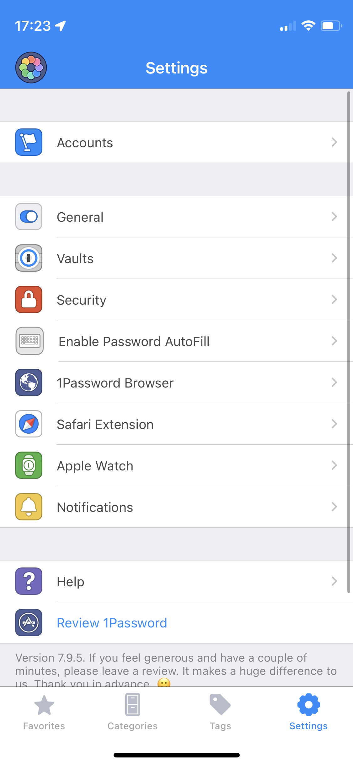
As a longtime user of 1Password 7, the redesign was immediately obvious when I opened the beta version of the app. As far as I can see, almost every icon has been changed to be a little more fun and colorful, and the interface feels more modern now.
1Password 7 opened to a favorite screen with a few recently used passwords. Other than selecting or deselecting logins as favorites, there was not much you could do to customize the screen. This was always a bit frustrating for me because I pretty much never needed any screen, and would immediately jump to search.
1Password 8, on the other hand, has a home screen that gives you access to things like your vaults, categories, and lists of newly created or changed passwords. You can also change it to suit how you organize and access your passwords – if you are a big user of categories, favorites and tags, you can move these options to the top. If you dump everything in one folder, you can hide everything except “All Items”.
:no_upscale()/cdn.vox-cdn.com/uploads/chorus_asset/file/23388556/customise_home.jpg)
The old (well, current) version of the app would tell you if one of your passwords had been compromised, and could alert you if the login you saw had a reused password, but there was not a single screen, that let you manage your overall security. The new version of the iOS app adapts the Watchtower section of the desktop version to mobile, which also gives you an overall security score.
:no_upscale()/cdn.vox-cdn.com/uploads/chorus_asset/file/23388560/watchtower.jpg)
There has been some controversy surrounding 1Password 8 after the company announced that its Mac apps user interface would be powered by Electron (the web browser technology behind apps like Slack, Evernote and Discord) instead of built-in code like SwiftUI or AppKit. Some users were concerned that the change would make password management more resource-intensive to run, or that it would feel less like a real Mac app. No matter how you feel about that change, it’s not really a factor with this iOS app, which 1Password has said uses SwiftUI for the interface and Rust as the core.
Of course, there are other reasons why you might not want to use an early access version of a password manager. Although it’s been okay for me so far, there will probably be a few bugs that testers may catch. If your phone’s password management is absolutely crucial to your work and / or life, it’s probably best to wait for an official release, especially since this update is a big change over the previous version. However, if you’re okay with increased odds of bumps and want to try the redesign for yourself as soon as possible, you can join TestFlight by using the link in 1Password’s blog post.


